Is There a Right Way to Look at Art?
People worry they're "doing it wrong" in museums. The truth is messier and more freeing than that, and a few simple habits change everything.
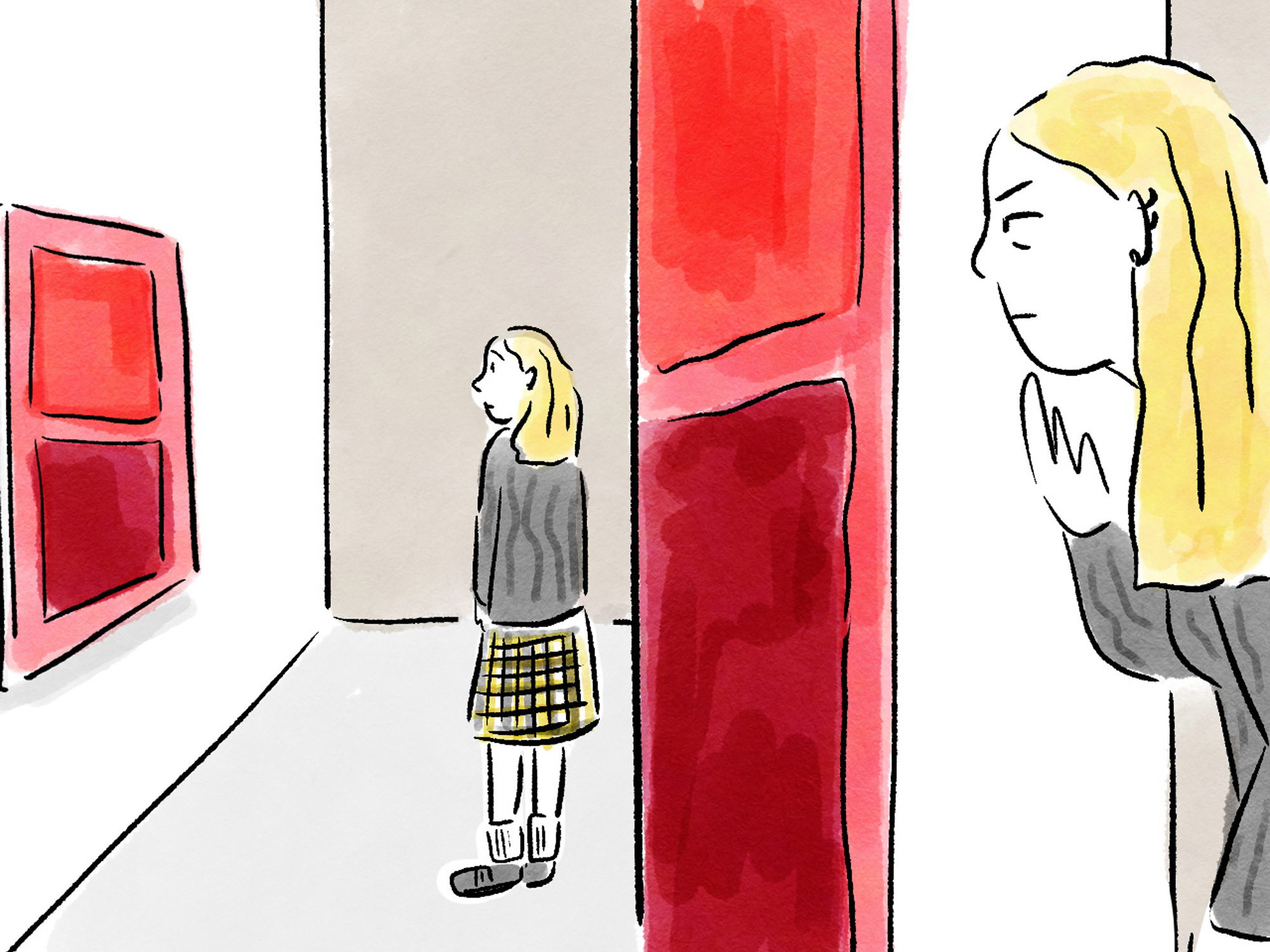
Short answer: no, there isn't one right way to look at art. Long answer: some ways of looking get you a lot further than others, and most people never learn them because nobody teaches you how to stand in front of a painting. You're handed a ticket, pointed toward a gallery, and left to fake it. So you do the thing everyone does. You glance for four seconds, read the wall label, nod, and move on.
There's research on this. A study at the Art Institute of Chicago, often cited in museum education circles, found that visitors spend a median of around 17 seconds in front of a single work. Other studies have put it closer to 28 seconds, including the time spent reading the label. Either way, you're looking at the art for less time than it takes to soft-boil an egg. The "wrong way" to look at art isn't a matter of taste or knowledge. It's just rushing.
Why the "right way" question is the wrong question
People ask whether there's a correct way to look at art because they're nervous. They've absorbed the idea that there's a secret code, that real art people know things they don't, and that admitting confusion in front of a Rothko is some kind of public failure. Go read the threads on Reddit where someone asks this exact question and you'll find the same split every time: half the replies say "look however you want, art is subjective," and the other half say "actually you should know the context." Both camps are a little right and a little annoying.
Here's the more useful framing. There's no right answer to extract from a painting, but there is a right amount of attention to give it. The goal isn't to decode a hidden meaning the curator approved. The goal is to have an actual experience instead of a hurried impression. And that's a skill, not a gift. You can get better at it this afternoon.
How are you supposed to look at art?
Start with what's actually in front of you before you reach for any context. The art historian and educator Philip Yenawine built an entire teaching method, Visual Thinking Strategies, around three plain questions: What's going on in this picture? What do you see that makes you say that? What more can you find? Notice that none of them require knowing the artist's name or the date. They just slow your eyes down and force you to point to evidence on the canvas.
I'd add a practical sequence to that. Try this the next time you're in front of something:
- Look before you read. Give the work thirty seconds before you touch the wall label. Let your eyes wander. Where do they land first, and why?
- Describe it out loud, or in your head, in plain words. "A woman in a green dress, turned away, in a room with one window." Description is underrated. It anchors you in the actual thing instead of your idea of it.
- Track your own eye. Notice the path your gaze takes around the picture. Good composition is basically a set of instructions for where to look next. The artist built that route on purpose.
- Then read the label. Now context lands on top of your own seeing instead of replacing it.
That last point matters. If you read first, the label tells you what to think, and you spend the rest of your time confirming it. Look first and the label becomes a conversation instead of an instruction.
What the museum educators actually want from you
Most museum education departments have quietly given up on cramming facts into visitors. They'd rather you slow down and trust your own eyes. The Slow Art movement, which started in 2008 and now runs an annual Slow Art Day in hundreds of venues worldwide, is built on a single idea: look at five works for ten minutes each instead of fifty works for ten seconds each. Try it once and the math of a normal museum visit starts to feel insane.
How to read a painting, with a real example
Let's actually do one. Take Edward Hopper's Nighthawks from 1942, hanging at the Art Institute of Chicago. Forget what you know about it being famous. Just look.
First, where do your eyes go? Probably to the lit diner, because Hopper has surrounded it with deep, empty darkness. That brightness is doing the work of a spotlight. Now notice the shapes. The big curved glass wraps the four figures inside a glowing wedge, and the street outside is bare. There's no visible door into the diner. You can't get in, and they can't easily get out. Hopper never spelled that out, but your eye registers it as unease.
Then the people. Three customers and a server, and nobody is quite connecting. The couple sit close but don't touch. The man with his back to us is a closed shape, unreadable. Color is carrying mood here too, the sour yellow-green of the interior against the cool dark blue of the street. If you want to understand how those choices push a feeling, it's worth reading up on how artists actually use the color wheel, because Hopper's palette is a deliberate emotional decision, not an accident of the time of day.
You did all of that without a single fact about Hopper's biography. That's "reading" a painting. Description plus attention plus a willingness to ask what the choices do. The wall label adds that he painted it weeks after Pearl Harbor, that the loneliness has a wartime edge to it, and now the dread you already felt has a name. Context deepened your reading. It didn't manufacture it.
What is the 70/30 rule in art? And the 80/20 one?
These two come up constantly, so let's clear them up, because they're about making art more than looking at it, and people mix them up.
The 70/30 rule usually refers to balance and dominance in a composition. You let one element take up roughly 70 percent of the visual weight and the other around 30, instead of splitting everything 50/50. A landscape might be 70 percent sky and 30 percent land, or 70 percent calm and 30 percent activity. Equal halves feel static and indecisive. The uneven split gives the eye a clear main event and a supporting act. As a viewer, this is genuinely useful to know: when a picture feels "off" or boring, a dead-even split is often why.
The 80/20 rule, sometimes borrowed from the Pareto principle, shows up in art talk as a value or color guideline. Keep about 80 percent of the piece in a dominant value or temperature and 20 percent in contrast, so the contrast actually reads. If everything is loud, nothing is. Some teachers apply it to effort: 80 percent of the impact comes from 20 percent of the marks, usually the focal area you should refine hardest. Both rules are guidelines, not laws. Plenty of great paintings ignore them on purpose. But they explain why some images feel resolved and others feel like noise.
Knowing rules like these changes how you look, because you start spotting the decisions. A trained eye sees structure where an untrained eye sees only subject. If you want more of that vocabulary, the techniques every artist should know are a good map of the choices being made in almost any work you'll stand in front of.
What is Kerry James Marshall's art style?
This question gets searched alongside "how to look at art" for a good reason: Marshall is a case where looking and reading have to happen together. His style is figurative, large-scale, and rooted in the Western painting tradition (Renaissance composition, history painting, the grand canvas), but he populates that tradition with Black figures painted in a deep, near-absolute black. The choice is pointed. He's filling a gap in centuries of museum walls where Black bodies were mostly absent or marginal.
Look at a Marshall painting purely formally and you'll notice the craft: the staging, the patterning, the way he handles flatness against depth. Read it for context and you understand that the deep black skin isn't a stylistic quirk, it's an argument about visibility and who gets to be the center of a masterpiece. Both layers are real, and the work is richer when you hold them at once. We've gone deeper into that elsewhere, in a piece on Kerry James Marshall's art style, but the takeaway for looking is this: form and meaning aren't rivals. The "right way" to look at his work is to refuse to choose between them.
Does context cheat the experience?
Some people feel that learning the backstory ruins the purity of just looking. I think that's backwards. Cartoonist Lynda Barry, whose books on creativity get recommended in this exact corner of the internet, treats looking as an act of play and discovery rather than a test you pass or fail. Context isn't the answer key. It's another set of details to see with.
The strongest argument for context is that some art is genuinely illegible without it. A medieval altarpiece is a coded system. Abstract work can read as random until you understand what the artist was reaching for, which is partly why people keep asking why abstract art counts as art at all. Context doesn't replace your eyes. It gives them more to do.
How to look at art in a museum without burning out
Museums are exhausting because we treat them like a to-do list. Don't. A few habits that actually help:
- Pick a small target. One gallery, or one theme, or even one artist. Skip the rest guilt-free. The Louvre has roughly 35,000 works on display. Nobody sees them in a day, and trying makes you see nothing.
- Sit down. Use the benches. They're there because looking is physical and your feet will quit before your attention does.
- Let yourself dislike things. "I don't like this, and here's specifically what's bothering me" is a real act of looking. Indifference is the only true failure.
- Go back to one work twice. See it at the start of your visit and again at the end. It'll look different, because you will.
If you want a structured way to practice the slow-looking muscle from your couch, there's a surprisingly good game built around plain description that we've broken down in a full guide to Google's "Say What You See." It rewards the exact skill museums want from you: naming what's actually there.
Where to find art worth slowing down for
The looking gets easier when you're genuinely curious, and curiosity needs feeding. I keep up with the daily mix of art and visual culture that Colossal publishes, which has a habit of putting work in front of you that you'd never seek out yourself, from textile sculpture to data-driven installations. Seeing widely is part of seeing well. The more kinds of art you've actually looked at, the more your eye has to compare against.
And if you're worried that "real" art lives only behind glass in major institutions, it doesn't. The instinct to compose, to balance, to make something worth a second glance shows up everywhere, which is the whole point of the argument that you're more of an artist than you think. The eye you train in a museum is the same eye you use on a photograph, a poster, a meal, a street.
So, is there a right way to look at art? There's a right amount of honesty and a right amount of time, and that's about it. Stand still. Say what you see. Notice where your eye goes and ask why it went there. Read the label after, not before. Do that and the painting stops being a thing you're supposed to admire and becomes a thing you're actually having a conversation with. The four-second glance was never the rule. It was just the habit nobody told you to break.