What Is the 70 30 Rule in Art?
The 70 30 rule is one of those quiet compositional tricks that makes a painting feel right without you knowing why. Here's what it actually means and when to use it.
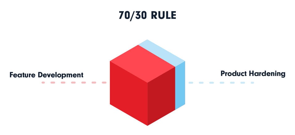
Ask ten painters about the 70 30 rule and you'll get answers that mostly agree, with a few arguments around the edges. At its core it's a proportion guide: you let one element dominate roughly 70 percent of your composition and give the remaining 30 percent to something that contrasts with it. The split keeps a picture from feeling static (the trap of a perfect 50/50) while avoiding the dullness of a single thing filling the whole frame.
That's the short version. The interesting part is everything the rule quietly controls: where the eye lands first, how much breathing room a subject gets, and whether a painting reads as calm or charged. Let me unpack it properly.
what the 70 30 rule actually governs
The 70 30 rule isn't one fixed thing. Painters apply the ratio to different properties depending on what they're after. The most common targets:
- Value (light vs. dark): about 70 percent of the canvas sits in one value range, 30 percent in the opposing one. A bright scene with a small pool of deep shadow, or a moody dark painting punctured by a sharp highlight.
- Color temperature: roughly 70 percent warm tones, 30 percent cool, or the reverse. This is closely related to the dominant-and-accent thinking behind the 60 30 10 rule, just simplified to two parts.
- Subject vs. negative space: the subject occupies about a third of the frame and the surrounding space the rest, or vice versa.
- Detail vs. simplicity: one section is busy and rendered, the larger part is left loose so the eye gets somewhere to rest.
The number itself is a target, not a law. Nobody measures with a ruler. If you eyeball a split that lands somewhere between 65/35 and 75/25, you're inside the spirit of it. The point is the imbalance. A dominant majority plus a meaningful minority creates a hierarchy, and hierarchy is what tells a viewer where to look.
Quick way to test it: squint at your painting until detail blurs into shapes of light and dark. If the canvas reads as one big mass and one clearly smaller mass, you've probably got a 70 30 split working, even if you never planned it.
why 70 30 beats a 50/50 split
This is the question that comes up most. What is the 50/50 rule in art? It's the deliberate equal split, dividing a composition into two halves of roughly equal weight, value, or color. It does have uses. A symmetrical landscape with a lake mirroring the sky, a portrait centered for formal stillness, a deliberately flat graphic design. Symmetry says calm, order, authority.
But 50/50 has a problem: when two areas carry equal weight, the eye can't decide which matters more, so it bounces back and forth or simply settles in the dead center. Many painters call this a tie, and a tie reads as indecision. The 70 30 split breaks the tie. It hands the viewer a clear winner and a clear accent, which is why it feels more dynamic. You get tension without chaos.
If you've ever wondered why some perfectly competent paintings feel boring, an unintended 50/50 is often the culprit. The fix is usually to push one side: more sky, less land. More shadow, less light. Shrink the subject and let the room around it grow.
where the rule comes from
The 70 30 idea didn't fall out of a single treatise. It's a folk simplification of much older principles about proportion and dominance that run through Western art theory. The asymmetrical balance it produces is close kin to what photographers know as the rule of thirds, which the Wikipedia entry on the rule of thirds traces back to the painter John Thomas Smith, who wrote about dividing a picture into thirds way back in 1797. Smith argued that placing the main subject off-center, at roughly a one-third division, produced a more pleasing balance than dead-center placement. That's the same instinct the 70 30 rule encodes, just expressed as area instead of grid lines.
You can see the lineage in landscape painting especially. The horizon rarely sits in the middle of a strong landscape. It sits low, giving the sky maybe 70 percent of the frame, or high, doing the reverse. Either choice commits to a dominant zone. That commitment is the whole game.
does it connect to the golden ratio?
Sort of, and people overstate it. The golden ratio works out to about 1 to 1.618, which translates to a split near 62/38. That's in the neighborhood of 70 30 but not identical. The 70 30 rule is a rougher, friendlier cousin you can apply without doing math.
Which leads to the question everyone wants answered: did Mona Lisa use the golden ratio? Honestly, the evidence is weaker than the internet suggests. People have overlaid golden rectangles on her face, her torso, the whole panel, and you can find a flattering fit for almost any famous painting if you draw enough boxes. Leonardo studied proportion seriously, he illustrated Luca Pacioli's 1509 book De Divina Proportione, which the Britannica entry on the golden ratio notes was the text that popularized the proportion among Renaissance artists. So Leonardo clearly knew the idea. Whether he consciously built the Mona Lisa's composition on phi is unproven and probably unprovable. What the painting does demonstrably do is sit her off-center and unbalanced against the landscape, which is pure 70 30 thinking whether he named it or not.
the rule in actual paintings
Theory means little until you see it. A few concrete cases:
Vermeer's interiors. In paintings like Woman Reading a Letter, the lit figure and window occupy a minority of the canvas while neutral wall fills the majority. Roughly a third doing the work, two thirds holding quiet. The emptiness isn't wasted; it's what makes the figure register.
Hopper's Nighthawks. The brightly lit diner anchors a chunk of the canvas, and the dark, empty street fills the rest. The contrast in both value and area is what gives the picture its lonely charge. Flip it to 50/50 and the unease evaporates.
Traditional ink landscapes. Classical Chinese painting is built on this. Vast washes of empty paper, a small cluster of mountains or a single boat. The negative space often runs well past 70 percent, and the restraint is the entire point.
You'll also catch the principle in contemporary work that has nothing to do with old masters. Browse the painting and installation features over at Colossal and you'll notice how often a single dense focal area sits against a large field of quiet. The proportions shift, but the instinct to weight one zone heavily against another shows up again and again, in muralists, ceramicists, and digital artists who've never opened a composition textbook.
using it deliberately
If you want to put the rule to work rather than just spot it, here's a practical approach for a painting or a photo:
- Decide your dominant property first. Is this a light painting with dark accents, or a dark painting with light accents? Pick one. Don't hedge.
- Block in the 70 percent before you touch the 30. Establish the majority zone as a flat mass, then carve the minority into it.
- Put your strongest contrast and most detail inside the 30. That's where the eye goes, so reward it.
- Resist filling the 70. The temptation to add interesting bits everywhere is what kills the effect. The big quiet area is a feature.
This dovetails with broader habits worth building. If you're still figuring out how to read a finished image, the way the eye travels across a frame is exactly what we get into in how you're supposed to look at art. The 70 30 split is one of the engines that directs that travel.
the 70 30 rule versus the 80/20 rule
What is the 80/20 rule in painting? It's the same family of thinking pushed further. The 80/20 split (often borrowed from the Pareto principle, the economics idea that 80 percent of effects come from 20 percent of causes) says let one element dominate even harder, with the accent shrunk to a fifth of the frame or less.
Painters reach for 80/20 when they want maximum drama or extreme calm. A near-black canvas with one small glowing window. A snowfield with a single figure. The smaller the accent, the more weight it carries, because scarcity reads as importance. The risk is going so far the painting feels empty or gimmicky.
So how do you choose? Think of it as a dial:
- 50/50: stillness, symmetry, formality. Use sparingly and on purpose.
- 70 30: balanced tension, the everyday workhorse, hard to get wrong.
- 80/20: high drama, minimalism, a single loud accent.
Most paintings live happily in the 70 30 zone because it gives you breathing room and a clear focal point at the same time. The other two are tools for specific moods. None of them is more correct, and the broader question of whether any compositional rule is binding is one I'd argue against; there's a longer case for that in our piece on whether there's a right way to look at art.
what is the 70 30 rule outside of art
Worth a quick note since people search it. The phrase 70 30 rule shows up in finance (a portfolio of 70 percent stocks, 30 percent bonds), in fitness and diet (results are 70 percent kitchen, 30 percent gym), and in time management. These aren't connected to the art version except by a shared intuition: a roughly two-to-one split between a dominant factor and a secondary one tends to feel both productive and balanced to humans. The art usage is just that instinct applied to a rectangle.
where the rule breaks down
I'd be lying if I called it universal. Plenty of strong work ignores it. All-over abstraction, like Pollock's drip canvases, deliberately refuses any dominant zone, spreading energy evenly across the whole surface. Pattern-based and decorative art often wants exactly the uniform repetition the 70 30 rule warns against. Some portraits demand dead-center symmetry to feel iconic and confrontational.
So treat 70 30 as a default to lean on while your eye develops, not a cage. It's the kind of guideline that's most useful when you're learning to see why a composition isn't working, and least useful once your instincts are good enough to break it on purpose. The number was never the point. The relationship between a loud part and a quiet part was, and there are a hundred good ratios to express it.
Next time a painting of yours feels flat, squint at it. If the shapes have settled into a tie, pick a winner and shrink the loser. The picture will usually thank you for it.