The 60 30 10 Rule for Painting, Explained
A decorating ratio everyone repeats but few explain well. Here is how the 60 30 10 rule works, why it works, and when to break it.
You have probably seen the 60 30 10 rule tossed around in paint forums, design YouTube, and the back half of home magazine articles. It sounds like a formula, which is comforting when you are standing in a hardware store holding fourteen paint chips and slowly losing the will to choose. The rule is real, it is useful, and it is also simpler than most people make it out to be.
Here is the short version: split a room's color into three parts. About 60 percent goes to your main color, 30 percent to a secondary color, and 10 percent to an accent. That ratio is the whole thing. Everything else is just learning where to put each percentage.
what the 60 30 10 rule for painting actually means
The 60 30 10 rule is a proportion guide for distributing color across a space. It comes out of interior design, and it borrows logic that painters and stylists have used for a long time without naming it. The numbers refer to how much of a room each color should cover, not the number of colors you can use.
- 60 percent: the dominant color. This is usually your walls. It sets the mood and is the thing your eye reads as "the color of the room."
- 30 percent: the secondary color. Think furniture, an area rug, curtains, maybe an accent wall or built-in cabinetry. It supports the main color and gives the eye somewhere to move.
- 10 percent: the accent. Throw pillows, art frames, a vase, a lamp, trim in a punchy shade. The smallest slice, doing the loudest work.
The reason it holds up is basic visual balance. Too much of one color flattens a room. Equal thirds of three colors fight each other and nothing wins. A clear hierarchy (one boss color, one helper, one spark) reads as deliberate even when you assembled it slowly over years. That balance between order and surprise is the same instinct behind a lot of color theory basics that artists actually use on the color wheel.
Quick gut check: stand in the doorway and squint. If one color is swallowing the room, or if three colors are clearly arm-wrestling for attention, your ratio is off. The 60 30 10 split is what "calm but not boring" looks like in numbers.
how to apply it when you are painting walls
If your question is specifically about paint and not the whole room, the rule shifts slightly because paint covers more surface than fabric or objects ever will.
For walls in a single room, the dominant 60 percent is almost always the main wall color. The 30 percent might be a darker or contrasting shade on one wall, on wainscoting, or on the ceiling if you are feeling bold. Painted ceilings are having a moment, and a soft color overhead is an easy way to claim that middle slice. The 10 percent is your trim, your door, or a painted alcove.
a worked example for a living room
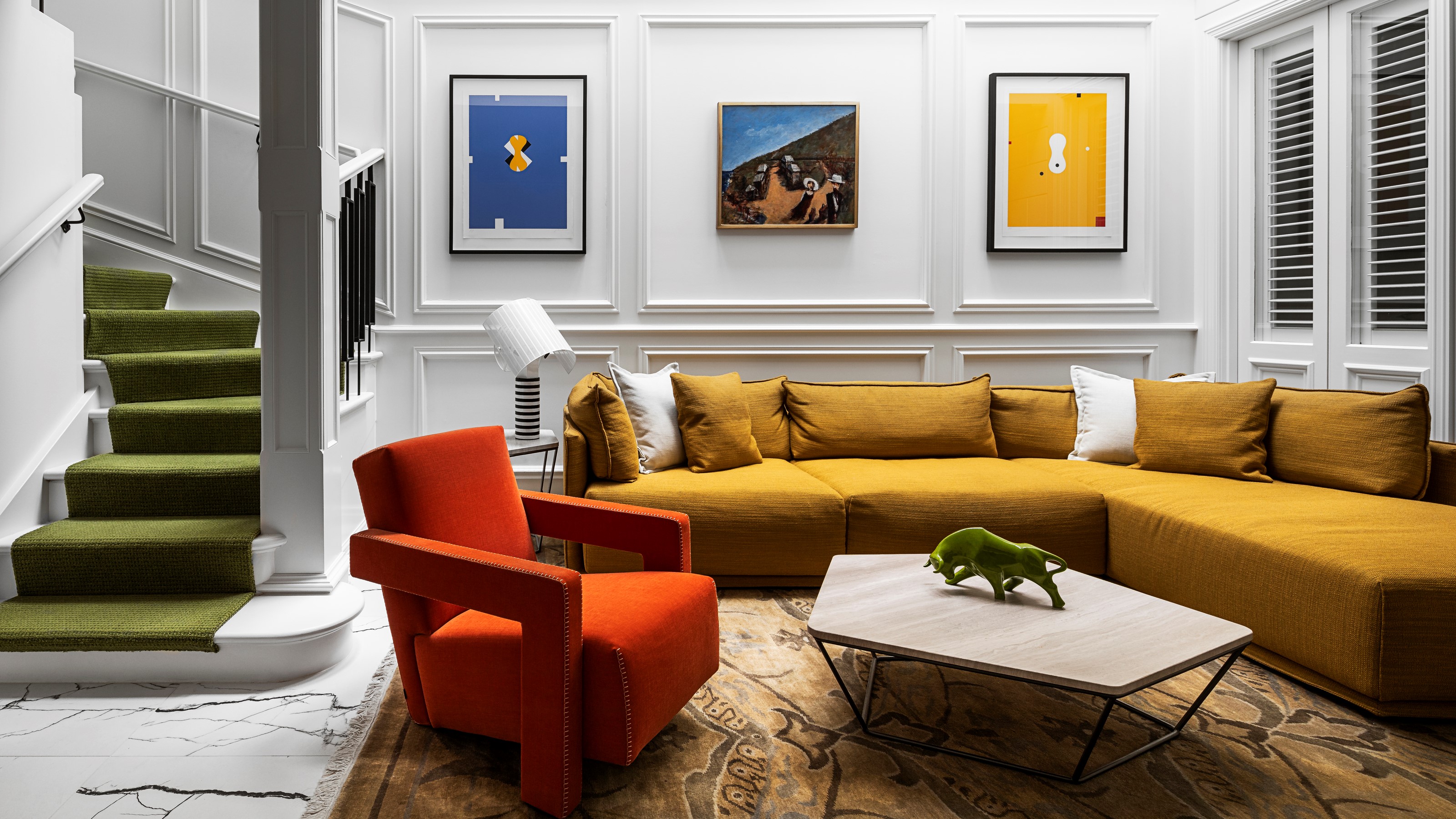
Say you want a warm, lived-in living room. Here is one honest breakdown:
- 60 percent: a warm off-white or greige on the main walls. This is your envelope.
- 30 percent: a deep olive or clay tone on a sofa, a rug, and the curtains. It grounds the room without darkening every wall.
- 10 percent: a terracotta or mustard accent in cushions, a ceramic lamp base, and the mat around a framed print.
Notice the 30 percent here is furniture and textiles, not paint. That is normal. Most rooms get their secondary color from things you can swap out, which is good news because it means you can change the room's whole feel without repainting.
walls, interior, and exterior versions
People search for this rule in a dozen flavors (walls, interior, living room, exterior) and the answer barely changes. The proportions stay the same. What changes is where the colors land.
On a house exterior, the 60 is your siding or main body color, the 30 is the roof and major trim, and the 10 is the front door, shutters, or window boxes. Painting a door a confident color is the classic 10 percent move because it is small, reversible, and high impact. Designers love it for exactly that reason.
the 60 30 10 rule with 4 colors
This is the variation people get stuck on. The rule assumes three colors, so what do you do with a fourth?
You have two clean options. The first is to split the 10 percent accent into two colors, roughly 5 and 5, so your accents read as a small curated pair rather than one note. The second is to treat your fourth color as a near-neutral that lives inside the 30 percent, like adding a soft gray-blue alongside a charcoal. The danger with four colors is sliding back into that equal-thirds mush where nothing leads. Keep one color clearly dominant and you can carry as many supporting players as you want.
Plenty of bold interiors use five or six colors. They just hide the complexity behind a strong 60 percent base. Look closely at the maximalist rooms that go viral and you will usually find one quiet dominant tone doing the heavy lifting under all that pattern. The eye needs somewhere to rest.
where the rule comes from, and why designers keep teaching it
The exact origin is murky, which is true of most decorating shorthand. The closest documented cousin is the way fashion stylists describe outfits, and the proportions echo guidance you will find in the broad field of interior design, where balance and proportion are treated as foundational rather than optional. Color authorities lean on it too. Sherwin-Williams and Benjamin Moore both publish versions of the rule in their consumer guides, usually framed as the easiest way for a non-designer to avoid a chaotic room.
The reason it survives is that it is teachable. You can explain it in one sentence and someone can use it that afternoon. Compare that to telling a beginner to "develop an eye," which is true but useless on a Saturday. The artists and writers I follow at Colossal, the long-running art and design magazine, rarely talk in tidy ratios, because working artists internalize this stuff and then bend it on instinct. The rule is the training wheels version of what they do without thinking.
If you want to see how this kind of balance plays out in actual paintings rather than living rooms, it is worth looking at how the stories behind famous paintings often hinge on a single dominant tone broken by one sharp accent. The instinct is the same. The scale is different.
what is the 70 20 10 rule for decorating?
The 70 20 10 rule is the same idea with a steeper hierarchy. The dominant color takes up more of the room (70 percent instead of 60), the secondary shrinks to 20, and the accent stays at 10. People reach for it when they want a calmer, more monochromatic space where the main color clearly rules and the supporting color is barely more than a whisper.
Use 70 20 10 for bedrooms and quiet rooms where you want serenity. Use 60 30 10 for living rooms and kitchens where you want a bit more energy and contrast. They are tools for different moods, not rivals. If your room feels too busy under 60 30 10, dialing it toward 70 20 10 will settle it down.
what are the disadvantages of 60 30 10?
The rule has real limits, and pretending otherwise does you no favors.
- It can produce safe, generic rooms. Followed too literally, you get the exact tasteful-but-forgettable interior that fills rental listings. The rule prevents disasters but it does not create personality on its own.
- The percentages are vague. Nobody measures square footage of color. "About 60 percent" is a feel, and beginners sometimes obsess over hitting the number instead of trusting their eye.
- It ignores undertone. Three colors in perfect proportion can still clash if their undertones fight (a warm beige against a cool gray, for instance). The ratio says nothing about whether the colors actually belong together.
- It assumes a closed room. Open-plan homes flow from space to space, and a strict 60 30 10 in each zone can feel choppy unless you carry a thread of color through the whole floor.
- Light wrecks the math. A north-facing room and a south-facing room will read the same paint completely differently, and no ratio accounts for that.
Treat the rule as a starting structure, then trust what your eyes tell you in the actual room at the actual time of day. The best decision I ever made was painting two test patches and living with them for three days before committing. The ratio got me in the right neighborhood. My eyes picked the house.
what color is replacing gray in 2026?
Gray dominated interiors for roughly fifteen years, and the backlash has been building for a while. The shades getting named as its replacement are warm neutrals and earthy browns. Benjamin Moore's 2025 color of the year was Cinnamon Slate, a muted plum-brown, and Pantone's 2025 pick was Mocha Mousse, a soft chocolate. The trend lines for 2026 keep pointing toward warm browns, terracottas, and rich greens. Gray is not dying so much as warming up into greige and going quietly into the background.
If you are reading this in a year well past 2026, the specific color hardly matters. What matters is the pattern: trend colors cycle, and chasing them is how you end up repainting every three years. Trends mostly live in your 10 percent and your 30 percent, the parts that are cheap and easy to change. Keep them out of your 60 percent unless you genuinely love the color, not just the moment.
what are the three paint colors that will never go out of style?
Three safe answers, and they all earn their place in the dominant 60 percent slot:
- A warm white. Not stark builder white, but a soft white with a touch of warmth. It works in any light, with any accent, in any decade.
- A versatile greige. The gray-beige hybrid bridges warm and cool palettes, which is why it survived the gray backlash mostly intact.
- A deep navy or charcoal. A grounding dark that has been considered tasteful for centuries, equally at home in a library or a kitchen island.
These work because they are low-saturation and adaptable. You can build any palette on top of them. Save your courage for the accents, where a mistake costs a throw pillow instead of two days and a sore shoulder.
using the rule without being ruled by it
The honest truth is that 60 30 10 is a confidence aid more than a law. It gives you a defensible starting point so you stop second-guessing every chip. Once a room is roughly in balance, your own judgment takes over, and judgment improves the more you look. Spending time learning to actually read color and composition (the same skill behind asking whether there is a right way to look at art) will do more for your rooms over time than any single ratio.
So paint the big walls a color you can live with for a decade. Pick a secondary that supports it without competing. Then go a little bolder than feels comfortable on that last 10 percent, because that small slice is where the room stops being correct and starts being yours.